
I love snowboarding: I’ve been doing it for the last 25 years. I started off renting snowboards at a tiny ski area in Missouri (yes, you read that right, I learned how to snowboard in Missouri). I graduated from bunny slopes to blues and made my way to the terrain park, learning boxes, wiping out on rails, and catching decent air on jumps. These days I’m more of an all-mountain freerider: carving groomers, speeding down blacks, darting through trees, and trekking the backcountry to wind-whipped bowls in search of untouched snow. In today’s era of data collection, I couldn’t help but wonder: could I collect data about my snowboarding trips? These kinds of data experiments are fun ways to figure out how we can improve our own lives. Can I use this data to enhance my on-mountain performance? Where was I fastest? Where can I go faster? What is my heart rate during runs? Does my heart rate correlate with speed? And just how good of a workout is snowboarding, anyway? Armed with a smartphone, smartwatch, and a 157cm snowboard, I set off to find out.
Data collection
To get started, I needed two key data sources: heart rate and my GPS coordinates. My Google Pixel Watch 2 collects biometric data about me constantly, using Fitbit to track my heart rate. Thanks to Google Takeout, I can snag all this data any time I want.
GPS data takes a bit more effort. I needed to use an app that regularly tracks location and speed. There are plenty of apps that do this, and for this case, I chose Slopes. I chose this because my friends and family all use it to find each other on the mountain. It also happens to collect a ton of data about you, has smart features to distinguish between being on a lift or a run, and gives you some cool stats. Even better: it lets you export your data so you can dive into your own analysis. Perfect. Let’s look at what I captured and see what it can tell us.
Heart rate data
Heart rate data comes in as a JSON file for each day that heart rate data was successfully collected. Here’s a sample of what that looks like:
[{ "dateTime" : "01/25/24 07:00:03", "value" : { "bpm" : 77, "confidence" : 2 } }, { "dateTime" : "01/25/24 07:00:08", "value" : { "bpm" : 73, "confidence" : 3 } }, { "dateTime" : "01/25/24 07:00:13", "value" : { "bpm" : 72, "confidence" : 2 } }] |
Measurements are taken approximately every 5 seconds. Each measurement includes a confidence value ranging from 0 to 3. A value of 0 indicates no reading was possible, while a 3 represents the best signal and measurement possible. It’s a simple and generally reliable stream of biometric data, but we’ll learn about its flaws later after we extract it.
GPS data
GPS data comes in GPX format. Short for “GPS Exchange,” it’s a lightweight XML standard used to store location data over time. A typical snippet from the Slopes app looks like this:
<trkpt lat="38.411433" lon="-79.995383"> <ele>1447.683951</ele> <time>2024-02-23T09:02:09.378-05:00</time> <hdop>4</hdop> <vdop>0</vdop> <extensions> <gte:gps speed="1.352658" azimuth="210.500000"/> </extensions> </trkpt> |
Each <trkpt> block represents a single point in time, with latitude, longitude, elevation, timestamp, GPS signal quality, speed, and azimuth (compass direction). This gives us a rich trail of movement across the mountain.
GPS metadata
Now here’s where it gets interesting: the Slopes app knows whether I’m on a lift or on a run. But that metadata isn’t in any of the GPX files. Rather, it’s in a .slopes file. When you open it in a text editor, it looks like gibberish.

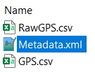
But wait a minute… I see “RawGPS.csv” in there. And it starts with PK – a big clue. For you eagle-eyed readers, you already know where this is going. A file that starts with PK is a key signature of a ZIP file. So, what happens if we open it up as a ZIP file?
That’s right: a .slopes file is simply a ZIP file. What we’re after is in Metadata.xml:
<Action start="2024-01-25 09:13:30 -0700" end="2024-01-25 09:24:29 -0700" type="Lift" …> <Action start="2024-01-25 09:27:35 -0700" end="2024-01-25 09:32:36 -0700" type="Run" …> |
Each <Action> element tells us whether the segment is a lift or a run, and includes start and end times, run/lift number, distance, vertical drop, average speed, and more. With this, we can identify whether we’re on a lift or a run in the GPS data. You may be wondering: why not use GPS.csv or RawGPS.csv? The main reason is that they do not have headers, I’m unsure of how to interpret every column, and I don’t know the difference between the two files. For example, these are the first three rows of RawGPS.csv:
| 1706196100.182000 | 39.60877 | -105.942 | 2845.7 | 42.1 | 3.234756 | 3.8 | 7.4 |
| 1706196101.181000 | 39.60877 | -105.942 | 2845.7 | 40.4 | 2.488026 | 4.2 | 6.4 |
| 1706196120.988000 | 39.60878 | -105.942 | 2848.8 | 165.7 | 0 | 4.7 | 4.8 |
I can make educated guesses on some of them, but I can’t guarantee that I’m going to be right. Since the GPX file has all the data I need and is fully labeled, I’m sticking with that.
All right. We’ve got heart rate data. We’ve got GPS data. We’ve got metadata that tells us when the lifts and runs are. Let’s build an action plan to turn this pile of raw data into something useful.
The plan
To work with this data, we need a solid approach to get it into the right format for exploration. Let’s break this down into a series of steps:
- Extract – Pull in the raw data with minimal modification so we can clean it up later. Since we’re working with JSON and XML, Python is a natural choice for this step.
- Transform – Convert the data into a format suitable for analysis and visualization. This can get fairly advanced, especially since we need to do a potentially computationally expensive join with our GPS metadata (which I found a surprisingly efficient solution for). We also need to fuzzy-merge our GPS data with our heart rate data to estimate what my heart rate was at a given location and time. For this kind of data manipulation, I’ll leverage the strengths of SAS.
- Visualize – I want to build an interactive dashboard out of this data. I have a SAS Viya environment, so SAS Visual Analytics is what I’ll use for both exploring and visualization.
To combine both Python and SAS in a lightweight environment with quick context switching, SAS Viya Workbench is my programming tool of choice.
While I was sitting on a lift with my uncle, I told him about this project. His response? “If I had to choose between poking myself in the eye and learning how to manipulate the data, I’d poke myself in the eye.” He’s very tech-savvy, but not particularly data-savvy. If this sounds like you, skip down to the Visualize section to see the fun stuff. But if you want to get into the nitty gritty details of extracting and transforming the data, then read on.
Extract
We have two types of files that we need to deal with:
- JSON
- XML
I really like how Python handles both JSON and XML, so we’ll use it to extract all our raw data with minimal changes. So, you can work with the data too, it’s all hosted on my GitHub. Simply clone it into an environment and you’ll have everything. Here is a list of the packages we need:
import pandas as pd import json import os import xml.etree.ElementTree as ET import requests from zipfile import ZipFile from dateutil import parser |
Extract heart rate data
First, let’s read in our heart rate JSON data. There’s nothing tricky about reading it: pd.json_normalize() does all the heavy lifting.
df_list = [] for json_file in os.listdir(hr_data): with open(os.path.join(hr_data, json_file)) as f: data = json.load(f) df = pd.json_normalize(data, sep='_') df.columns = df.columns.str.lower().str.replace('value_', '') df['datetime'] = ( pd.to_datetime(df['datetime'], format='%m/%d/%y %H:%M:%S', utc=True) .dt.tz_localize(None) ) df_list.append(df) df_hr = ( pd.concat(df_list, ignore_index=True) .drop_duplicates(subset=['datetime'], ignore_index=True) .rename(columns={'datetime':'timestamp'}) .sort_values('timestamp') .reset_index(drop=True) ) |
Which gets us our heart rate dataframe:
| timestamp | bpm | confidence |
| 2024-01-25 07:00:03 | 77 | 2 |
| 2024-01-25 07:00:08 | 73 | 3 |
| 2024-01-25 07:00:13 | 72 | 2 |
| 2024-01-25 07:00:18 | 81 | 2 |
| 2024-01-25 07:00:23 | 89 | 2 |
| ... | ... | ... |
| 2025-03-16 02:56:21 | 111 | 1 |
| 2025-03-16 02:56:23 | 112 | 1 |
| 2025-03-16 02:56:25 | 114 | 1 |
| 2025-03-16 02:56:27 | 120 | 1 |
| 2025-03-16 02:56:29 | 118 | 2 |
Note that the time is in UTC, and we’ve removed the offset. This is on purpose to help with some conversions we’ll need to do in SAS. Depending on the date, I was in West Virginia or Colorado, meaning we’ll have to account for the time zones. We’ll work this out later.
Extract GPS data
Now it’s time to get our GPS data. This one is a bit tricky: the data itself not only has XML, but has a built-in extension that also has its own XML schema. This means we have two namespaces to work with. Thankfully, these namespaces are in the file xml.etree.ElementTree, which makes parsing this file and grabbing each element a snap.
gpx_namespace = '{http://www.topografix.com/GPX/1/1}' gte_namespace = '{http://www.gpstrackeditor.com/xmlschemas/General/1}' all_gps_data = [] file_list = [file_name for file_name in os.listdir(gps_data) if file_name.endswith(".gpx")] for gpx_file in file_list: with open(os.path.join(gps_data, gpx_file)) as f: root = ET.parse(f) for trkpt in root.findall(f'.//{gpx_namespace}trkpt'): time_elem = trkpt.find(f'{gpx_namespace}time') elev_elem = trkpt.find(f'{gpx_namespace}ele') gps_elem = trkpt.find(f'.//{gpx_namespace}extensions/{gte_namespace}gps') row = { "timestamp": parser.parse(time_elem.text, ignoretz=True), "lat": float(trkpt.get("lat")), "lon": float(trkpt.get("lon")), "elevation": float(elev_elem.text), "speed": float(gps_elem.get("speed")), "azimuth": float(gps_elem.get("azimuth")) } all_gps_data.append(row) df_gps = ( pd.DataFrame(all_gps_data) .drop_duplicates(subset=['timestamp'], ignore_index=True) .sort_values('timestamp') .reset_index(drop=True) ) |
Which gets us this:
| timestamp | lat | lon | elevation | speed | azimuth |
| 2024-02-23 09:02:09.378 | 38.411433 | -79.995383 | 1447.683951 | 1.352658 | 210.500000 |
| 2024-02-23 09:02:51.876 | 38.411521 | -79.995349 | 1447.111577 | 5.878414 | 344.000000 |
| 2024-02-23 09:03:11.875 | 38.411477 | -79.995350 | 1447.233919 | 0.000000 | 15.000000 |
| 2024-02-23 09:04:40.509 | 38.411416 | -79.995373 | 1447.565993 | 3.368827 | 190.000000 |
| 2024-02-23 09:05:25.872 | 38.411602 | -79.995469 | 1447.554227 | 0.216851 | -1.000000 |
| ... | ... | ... | ... | ... | ... |
| 2025-03-15 12:42:56.898 | 39.681001 | -105.897156 | 3303.727416 | 8.048152 | 194.899994 |
| 2025-03-15 12:43:10.360 | 39.681136 | -105.897129 | 3300.838124 | 1.397895 | 0.800000 |
| 2025-03-15 12:43:25.401 | 39.681041 | -105.897067 | 3304.196649 | 3.963804 | 153.300003 |
| 2025-03-15 12:43:30.404 | 39.681145 | -105.897119 | 3305.099298 | 4.070401 | 339.799988 |
| 2025-03-15 12:43:35.426 | 39.681107 | -105.897238 | 3303.817325 | 4.244938 | 254.899994 |
Since the GPS knows where you are, the timestamps are already in the expected time zone. Again, we ignore the time zone on purpose so we can do some easy conversion later. Now that we have both our heart rate and GPS data, we have one piece of the puzzle left: GPS metadata.
Extract GPS metadata
This is a standard XML file and is simple to read with pd.read_xml(). We will read it in as a dataframe, parse the start/end times, remove the time zone, and we’re all set.
df_list = [] file_list = [file_name for file_name in os.listdir(gps_data) if file_name.endswith(".slopes")] for slopes_file in file_list: with ZipFile(os.path.join(gps_data, slopes_file), 'r') as zip_file: with zip_file.open('Metadata.xml') as xml_file: df = pd.read_xml(xml_file, parser='etree', xpath='.//Action') df[['start', 'end']] = df[['start', 'end']].map(lambda x: parser.parse(x, ignoretz=True)) df_list.append(df) df_gps_meta = ( pd.concat(df_list, ignore_index=True) .sort_values('start') .reset_index(drop=True) ) |
This gets us a fairly wide file. Here are just a few of the columns we care about:
| start | end | numberOfType | type |
| 2024-02-23 10:02:43 | 2024-02-23 10:11:47 | 1 | Lift |
| 2024-02-23 10:12:04 | 2024-02-23 10:15:11 | 1 | Run |
| 2024-02-23 10:16:40 | 2024-02-23 10:22:12 | 2 | Lift |
| 2024-02-23 10:23:05 | 2024-02-23 10:26:35 | 2 | Run |
| ... | ... | ... | ... |
| 2025-03-15 11:49:58 | 2025-03-15 11:52:43 | 10 | Run |
| 2025-03-15 12:22:13 | 2025-03-15 12:25:39 | 10 | Lift |
| 2025-03-15 12:26:07 | 2025-03-15 12:29:17 | 11 | Run |
| 2025-03-15 12:30:37 | 2025-03-15 12:33:12 | 11 | Lift |
| 2025-03-15 12:33:40 | 2025-03-15 12:38:05 | 12 | Run |
Phew! We now have all the raw data we need. Let’s save these as parquet files to get them into the format we want for visualization.
Transform
Now that we’ve wrangled the raw files into something usable, let’s hop over to SAS to finish prepping the data. One thing I love about VS Code in SAS Viya Workbench is how fluid the dual-language experience is: I can have one tab open for Python and another for SAS. Switching between them is as easy as flipping browser tabs.
First, I’m in Python…

…and now I’m in SAS.
![]()
SAS has a few useful tools that we can use to do some fairly complex joins to get the data into the format that we want for visualization. We can work with parquet data directly and even cross between SAS datasets and parquet datasets without doing anything different to our code.
Aligning time zones
First thing’s first: aligning time zones for the heart rate data. This is why we removed the time zone offset. SAS doesn’t always play nicely with pandas-style offsets, and this avoids issues later on. Since heart rate data is always in UTC, we need to convert it over to Mountain or Eastern time depending on the date. I like the DATA Step for this because it’s very readable, and I can easily tweak it later when I add new trips.
data hr; set pq.hr; date = datepart(timestamp); /* Convert to MT */ if( '25JAN2024'd <= date <= '28JAN2024'd OR '13MAR2025'd <= date <= '15MAR2025'd) then timestamp = intnx('hour', timestamp, -7, 'S'); /* Convert to ET */ else if( '23FEB2024'd <= date <= '24FEB2024'd OR '09FEB2025'd <= date <= '10FEB2025'd) then timestamp = intnx('hour', timestamp, -5, 'S'); drop date; run; |
Merging metadata (fast)
Now we need to identify which run our GPS points belong to. Our GPS metadata has start and end times for each segment, as well as whether it’s a lift or a run, and gives us a run or lift number. In addition, this will allow us to only keep points that matter, removing extraneous times such as breaks or long waits at the lift line.
At first glance, this might sound like a job for a SQL join using BETWEEN. But there's a catch: that kind of logic triggers an unoptimizable cartesian product join under the hood. That means SQL has to compare every single GPS point to every metadata interval.
To put that into perspective:
We’ve got 32,431 GPS points and 286 metadata intervals. That’s over 9.2 million potential comparisons (32,431 × 286) that SQL has to scan just to figure out what matches. SQL can handle computations like this, but we can do way better. Instead, I had a trick up my sleeve: hash tables.
Hash tables in SAS are blazing fast for lookups, scale well, and are perfect for efficient joins of big tables with small tables. In this case, we can take further advantage of the fact that both datasets are sorted by time. Instead of comparing everything to everything, we can dynamically walk through metadata only when we need to. No cartesian join. No do-while loop. Just clean, efficient, timestamp-based logic.
Here’s how it works:
- The metadata is loaded into a hash table once and assigned an iterator
- For each GPS timestamp, we check whether we’ve passed the end of the current interval
- If so, we advance the hash iterator to the next row in the hash table and grab the values
- If we’re inside an interval, we tag the point accordingly as part of a lift or run and output it
data gps_filtered; set pq.gps; retain start end type numberOfType rc; if(_N_ = 1) then do; format type $4.; dcl hash meta(dataset: 'pq.gps_meta', ordered: 'yes'); meta.defineKey('start', 'end'); meta.defineData('start', 'end', 'type', 'numberOfType'); meta.defineDone(); dcl hiter iter('meta'); call missing(start, end, type, numberOfType); rc = iter.first(); end; if(timestamp > end) then rc = iter.next(); if(rc = 0 and start <= timestamp <= end) then do; if(type = 'Run') then run_nbr = numberOfType; else lift_nbr = numberOfType; output; end; drop start end type numberOfType rc; run; |
This whole process only takes about 0.03 seconds to complete. That makes it 286 times faster than the equivalent SQL query where it needs to crunch through over 9 million observations:
proc sql; create table gps_filtered as select gps.* , meta.type , CASE(meta.type) when('Lift') then meta.numberOfType else . END as lift_nbr , CASE(meta.type) when('Run') then meta.numberOfType else . END as run_nbr from pq.gps inner join pq.gps_meta as meta on gps.timestamp BETWEEN meta.start AND meta.end ; quit; |
If you run this code and look at the log, you’ll see this message:
NOTE: The execution of this query involves performing one or more Cartesian product joins that can not be optimized.
By using a DATA Step hash table, we avoid this problem entirely.
Now we need to bring our GPS and heart rate data together. There’s just one problem: they’re captured at different intervals. Not only that, but sometimes the data is missing. With over 30,000 GPS coordinates and 160,000 heart rate captures, a simple join won’t work. Instead, we’ll go for a fuzzy join.
For each GPS point, we want to find the heart rate capture with the closest timestamp. For example:
| GPS Timestamp | Heart rate Timestamp | Heart rate |
| 2024-28-01 12:00:00 | 2024-28-01 11:59:56 | 100 |
| 2024-28-01 12:00:01 | 102 |
We want to associate the second heart rate capture with the GPS point since its timestamp is closest. We’ll then repeat this for all points. To do this, we’re going to take advantage of some SAS SQL features:
- We can group by calculated items
- We can include as many columns as we want in the select clause even with only one GROUP BY column
- SAS will remerge summary statistics for us for filtering with the HAVING clause
To help the query be more efficient, we’re going to join both tables by day, hour, and minute. This means there are fewer comparisons that need to be made to find the closest timestamp. Rather than comparing every single heart rate timestamp with a single GPS timestamp, it will only compare rows where the day, hour, and minute match between the two. Here’s what this all looks like:
proc sql; create table snowboarding_gps_hr(drop=dif) as select round(gps.timestamp) as timestamp format=datetime.2 , gps.lat , gps.lon , gps.lift_nbr , gps.run_nbr , gps.elevation*3.28084 as elevation , gps.speed , hr.bpm , hr.confidence as hr_sensor_confidence , abs(round(hr.timestamp) - round(gps.timestamp)) as dif from gps_filtered as gps left join hr on dhms(datepart(gps.timestamp), hour(gps.timestamp), minute(gps.timestamp), 0) = dhms(datepart(hr.timestamp), hour(hr.timestamp), minute(hr.timestamp), 0) group by calculated timestamp having dif = min(dif) ; quit; |
This fuzzy join of 31,000 rows to 160,000 rows takes about a third of a second. And just like that, we’ve got our GPS points matched up with heart rate data.
Final Touches
To finish it all up, we’ll remove duplicates caused by tied timestamps, save our datasets, and load them up into SAS Visual Analytics. Easy!
Visualize
I’m a visual person. When I learned how to use dashboarding tools, my life was changed forever. Finally! Less coding - more visualizing! These days, one of my favorite ways to explore data is through a drag-and-drop visualization tool like SAS Visual Analytics. I can throw in visuals, explore tables, and even build explanatory statistical models to ensure that my data is making sense. Let’s start answering some of the burning questions I had before I embarked on this journey.
GPS
First, I want to confirm that my GPS data was all captured well. I made a guess that it’s projected in WGS-84, and thankfully, I was right – otherwise, that would have been a whole other research rabbit hole. As a whole, the data looks pretty good, but there are some days where runs have gaps, such as this day at Snowshoe in February 2025.

Cloudy weather has a strong effect on GPS signals, and my February 2025 trip to Snowshoe was especially overcast with a big snowstorm headed my way.
The GPS points aren’t perfect. Sometimes it places me in the woods when I’m really on the slopes. I’m using a smart phone in a pocket on a ski slope on a cloudy day, so it’s not too surprising that there are some inaccuracies. Not only that, but there are days where my phone froze (pun intended) in the middle of a session and there were no more points collected. Data: gone forever.
Next, let’s take a look at my fastest speed.
Speed

WHAT?! I’m pretty fast on a snowboard, but 100mph fast? There’s no way. This is clearly an outlier. In fact, Visual Analytics automatically identified this as an outlier, so let’s take a look at its outlier report for speed.
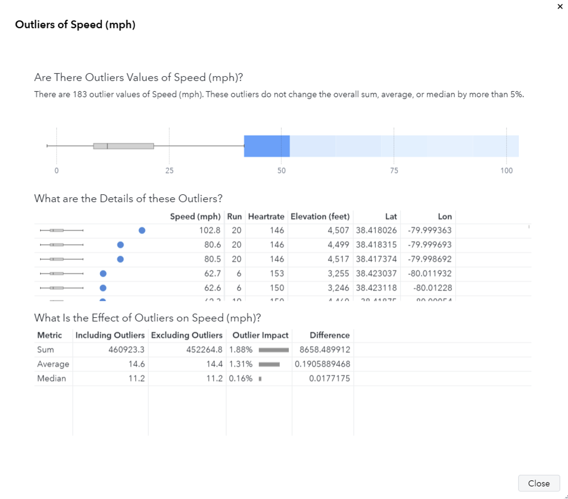
There are some interesting things going on here. The top 3 values of longitude are very similar, so these were all captured close to each other. Let’s look at my top 10 fastest points on a map.

| Rank | Mountain | Timestamp | Lat | Lon | Run | Speed (mph) |
| 1 | Snowshoe | 02/23/24 2:57:59 PM | 38.418026 | -79.99936 | 20 | 102.8 |
| 2 | Snowshoe | 02/23/24 2:58:00 PM | 38.418315 | -79.99969 | 20 | 80.6 |
| 3 | Snowshoe | 02/23/24 2:57:58 PM | 38.417374 | -79.99869 | 20 | 80.5 |
| 4 | Snowshoe | 02/10/25 12:14:06 PM | 38.423037 | -80.01193 | 6 | 62.7 |
| 5 | Snowshoe | 02/10/25 12:14:07 PM | 38.423118 | -80.01228 | 6 | 62.6 |
| 6 | Snowshoe | 02/23/24 2:43:10 PM | 38.41875 | -80.00054 | 19 | 62.3 |
| 7 | Snowshoe | 02/23/24 1:48:24 PM | 38.420651 | -80.00564 | 15 | 62.2 |
| 8 | Snowshoe | 02/23/24 1:48:25 PM | 38.420749 | -80.00593 | 15 | 62.2 |
| 9 | Snowshoe | 02/23/24 1:48:26 PM | 38.420554 | -80.00535 | 15 | 62.2 |
| 10 | Snowshoe | 02/23/24 1:48:27 PM | 38.420454 | -80.00506 | 15 | 62.2 |
All of them are at Snowshoe on Cupp Run in Western Territory, which is a run where I like to try to push my limits on how fast I can go. If you look at ranks 1, 2, 3, and 6, they are captured at similar locations, which is the top of the mountain in a section that isn’t particularly steep. Something funny happened here: for some reason, my GPS captured me going 80mph, then suddenly 103 mph before correcting itself to a more realistic speed. In fact, every single one of these values are a little odd given their location, and I don’t trust them. There are many possible reasons for this, but for those curious about why a GPS can give you a strange value, check out this article on GPS accuracy.
I tend to be fastest near the middle and bottom sections, which is where the slope is wide and steep. Here are my top 100 fastest recorded speeds on Western Territory at Snowshoe – almost all of them are on Cupp Run except for one run on Shay’s Revenge.

Most of my fastest speeds are clustered near the end of Cupp Run’s straight, steep middle section, and the speeds are all reasonable. We can see this more clearly if we look at all runs on Western Territory as a heat map.

Without moguls to slow me down, and a little luck with low crowds, you can ride that section straight and fast. I set out with a goal to hit 50mph, and given the data I’m looking at, I’m inclined to believe it. Goal: crushed. 🤙
Let’s hone in on heart rate.
Heart Rate
The data quality is generally good, but there are some days where absolutely no heart rate data was recorded whatsoever. Why? Who knows. All I know is that some days I have no file. It’s just not there. When you’re working with consumer devices that are constantly trying to collect data, you can only hope for the best. The good news is that we still have a lot of heart rate data to work with.
How good of a workout is snowboarding? I’ve never really known. Let’s take a look at my heart rate over time at Snowshoe and at Keystone.
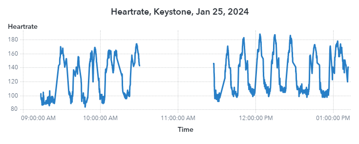

There’s a very clear pattern of when I am on a run and when I am on a lift. During a run, my heart rate can get pretty high – over 180 bpm – meaning I’m putting in a pretty darn good workout. Either that, or I had a very scary event. It’s impossible to say at this point. What I can say is that the results are very consistent. Snowboarding is kind of like a tabata set with longer rest periods thanks to lifts. If you’re taking on blues and blacks, especially ones with moguls, you’re putting in a good leg workout. If you want to get the best workout possible, out west at a big mountain with long runs is where you want to be.
Heart Rate vs. Speed
Now to answer my biggest question: how does heart rate correlate with speed?

Surprisingly, not as much as I expected, even after removing the 60+mph outliers. It’s a bit all over the place, and the correlation coefficient is only 0.2. In other words, my heart rate has a weak positive correlation with speed. If I ever want to truly answer this question, I’ll need a lot more data and more accurate capture methods. For now, I’ll just say there’s very little relationship between my heart rate and speed.
Conclusion
Data is all around us, and finding ways to collect and make sense of it is an exciting challenge that can unravel a lot of mystery. I wanted to see what I could do with data that’s already being gathered about me while doing something I love. Once you’ve got raw data, the world is your oyster. You can slice it, mash it up, and visualize it – and you may even find a few surprises. I could spend months trying to perfect and optimize this process, but since I’m not using this data to make any high-stakes decisions, “good enough” is good enough. After all, these are consumer-grade devices in harsh conditions, not lab-calibrated sensors. Some errors are expected.
In the end, what really matters is having the right tools to explore your data. Use what plays to your strengths: what you know, what you’re fast with, and what fits the task at hand. This project wasn’t all smooth riding. Just figuring out how to read the data was its own mini adventure. Some data was missing. Some data ended up being completely unusable. Others had surprise time zone mismatches that I only caught once I loaded them. I ran into bizarre outliers, like going 100mph at the top of a run. It was messy. But it was also fun.
What helped me push through is realizing I didn’t need to just pick one tool. I had a big toolbox: Python, SAS, and Visual Analytics. Each brought something different to the table. By leaning into their individual strengths, I went from raw telemetry to insights faster than if I forced everything through a single language. That’s the beauty of working across ecosystems: the more you know, the more options you have.
Now I’ve got a repeatable pipeline, a personal dashboard, and a whole new way to see how I ride. The season’s over for now, but next year’s data is going to be even better. I’ve already got new speed goals, ideas for additional tracking, and a wish list of metrics to explore.
Want to dive in yourself? Check out my code+data on GitHub and my snowboarding dashboard on github.io. I’ll keep adding new trips and building it out. Follow along if you want to see where it goes!
What I Used
- Python 3.11 – for data extraction
- SAS Viya Workbench – for Python and SAS coding
- SAS Visual Analytics – for data exploration and interactive dashboards
- Notepad++ – for quick file inspection
- Slopes App – for GPS tracking
- Google Pixel Watch 2 – for heart rate tracking
Links:
- Snowboarding Dashboard: https://stu-code.github.io/snowboarding-dashboard
- GitHub: Snowboarding Project Code and Data: https://github.com/stu-code/snowboarding

2 Comments
Great blog, Stu! Also a very nice example of how real-life data is not always perfect in quality, but can still be used to create valuable insights!
Thanks Jarno! Absolutely! So much of gathering new insights comes from cleaning data and removing known erroneous values and hoping that the majority of your other values make sense. This is why domain knowledge is so important: unless you know a subject really well, it can be really difficult to know whether a value makes sense or not. For example, I initially thought my 62mph speed was plausible, but after delving into where it was captured and the speeds before/after it, I know that it's nearly impossible to go that fast in that particular location on the slope. If I didn't know anything about that slope, I would have needed to do other calculations to estimate how steep that section is, and even then, those data points may have errors. But with my own experience on that slope I can shortcut all that, look at it and say "Yep, that doesn't make sense!" For all other strange values that might be lurking in the data, using robust techniques is a good way to reduce the effects of outliers, especially when it comes to statistical modeling and reporting.
For anyone who is a data scientist consultant reading this: always confirm odd values with your customer. They'll be able to tell you very quickly if something seems off or is worth investigating further. Your domain experts are your best friend.